A home can look expensive and still feel wrong the second you walk into it. The problem is rarely the sofa, the paint color, or the price of the rug; more often, it is the quiet disorder of the layout. Thoughtful Classy Layout Changes give a room that calm, settled confidence people notice before they know why they notice it. Good design does not shout for attention. It lets every chair, pathway, lamp, and empty corner do a job without making the room feel stiff. That is why timeless style starts with placement before decoration. A polished home needs rhythm, breathing room, and choices that age well past seasonal trends. For homeowners, renters, and design lovers who want ideas that feel current without becoming dated, trusted style resources such as home design inspiration can help frame the bigger picture. Still, the real work begins inside your own rooms, where small layout decisions can either support daily life or quietly fight against it every day.
Classy Layout Changes That Begin With Better Room Flow
A beautiful room loses its charm when moving through it feels awkward. Flow is the invisible part of design, yet it controls how relaxed, open, and useful a space feels. The smartest layout shifts often begin by asking one plain question: can someone walk, sit, reach, and live here without negotiating with the furniture? That question exposes more design problems than any mood board ever will.
How can elegant space planning make a room feel larger?
Elegant space planning starts with restraint, not with adding more pieces. Many rooms feel smaller because furniture floats without purpose, walkways pinch at odd points, and too many surfaces compete for attention. A living room with a large sofa pushed against one wall and two chairs blocking the natural route to the window may look furnished, but it does not feel settled. Pulling seating into a tighter conversation zone can open the edges of the room and make the whole space breathe.
The counterintuitive part is that moving furniture away from the wall can make a room feel bigger. People often assume open floor in the center creates spaciousness, but a hollow middle can make the layout feel unfinished. A better approach is to build a clear central zone and preserve clean pathways around it. That gives the eye structure and gives the body comfort.
Elegant space planning also depends on negative space. Empty corners are not failures. A blank wall beside a doorway, a quiet gap between a cabinet and chair, or a clear stretch of floor near a window can calm the room more than another accent table ever could. Space is part of the design, not leftover air.
Why does furniture spacing matter more than furniture size?
Furniture size gets blamed when spacing is the real offender. A generous sectional can work in a modest room if the walking paths stay clean and the visual weight is balanced. A slim chair can still ruin a space if it sits where every person has to squeeze past it. Scale matters, but spacing decides whether the room behaves.
Think about a dining room where chairs back directly into a sideboard. The furniture may be tasteful, but every meal becomes a tiny obstacle course. Shifting the table a few inches, choosing a narrower cabinet, or removing one decorative bench can change the whole mood. People relax when the room stops asking them to be careful.
Timeless home design favors comfort that looks effortless. It does not chase empty minimalism, and it does not reward crowded styling. The sweet spot sits between enough furniture to support real life and enough room to move without thought. That balance feels polished because it respects how people actually live.
Creating Balance Without Making Rooms Feel Staged
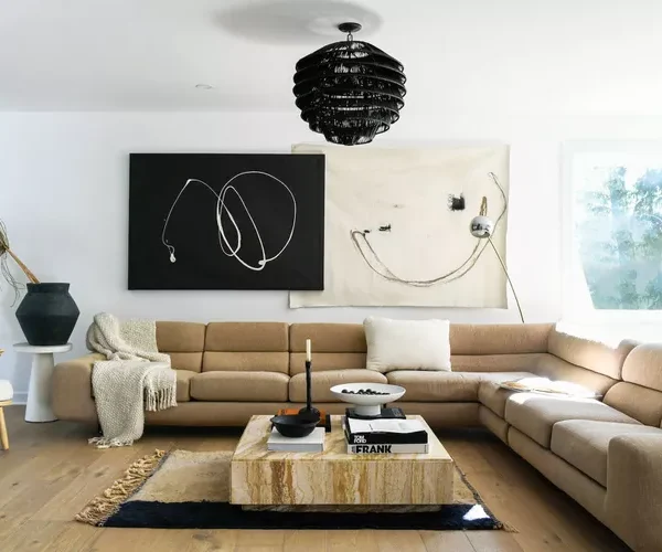
Once the room moves well, balance becomes the next test. Balance does not mean matching lamps, twin chairs, and perfect symmetry in every corner. That can turn a home into a showroom, and showrooms have one major flaw: nobody truly lives in them. Real balance feels composed, but it still leaves room for personality, use, and a little looseness.
How do balanced room layouts create quiet luxury?
Balanced room layouts create quiet luxury by controlling visual weight. A dark cabinet, a tall plant, a low sofa, and a bright window all carry weight in different ways. When one side of a room holds every heavy object, the space feels tilted even if the floor plan is technically practical. The eye senses imbalance before the brain names it.
A good example is a bedroom with the bed centered on the main wall, one tiny nightstand on one side, and a bulky dresser across the room. The fix is not always buying a matching set. A taller lamp, a framed print, or a narrow chest on the lighter side can restore order without making the room predictable. Balance does not require duplication. It requires conversation between parts.
This is where refined interior decor becomes more than surface styling. Decor should help the layout feel anchored, not scattered. A mirror can balance a doorway. A floor lamp can soften a heavy sofa. A textured ottoman can connect two separate seating pieces. The room starts to feel finished when every visual choice helps another one make sense.
What makes symmetry feel timeless instead of rigid?
Symmetry works best when it gives the room backbone, then steps aside. Matching nightstands in a bedroom, paired sconces beside a fireplace, or two chairs facing a sofa can create immediate calm. The danger comes when every object gets mirrored so perfectly that the space loses its pulse. A home needs order, but it also needs evidence of life.
A strong trick is to use symmetry for the main furniture and asymmetry for the smaller details. Place two chairs opposite a sofa, then style one with a throw and the other with a side table. Use matching lamps, then vary the art above each nightstand. The structure feels classic, while the details keep the room from going flat.
Classy Layout Changes work best when they make balance feel natural rather than staged. A timeless room should look as if it evolved through good judgment, not as if someone measured every object with nervous precision. That slight looseness matters. It gives elegance a human edge.
Choosing Focal Points That Do Real Work
After flow and balance come focus. A room without a focal point makes the eye wander until it gets tired. A room with too many focal points feels noisy, even when every item is beautiful on its own. The best layouts choose a clear anchor, then let the rest of the room support it with discipline.
How can timeless home design improve focal points?
Timeless home design improves focal points by choosing what deserves attention and what should stay quiet. A fireplace, picture window, built-in shelf, artwork, or bed wall can become the main anchor. The mistake is letting a television, cluttered console, busy rug, and gallery wall compete at the same volume. When everything asks for attention, nothing feels special.
A practical example sits in many living rooms: the sofa faces the television, but the best natural feature is a large window off to the side. Instead of pretending the window does not matter, angle the seating so the room acknowledges both views. Add a low console under the television, keep the window treatment clean, and let one strong piece of art connect the two. The layout then supports daily use without sacrificing character.
Focal points also need breathing room. A beautiful painting loses power when squeezed between tall shelves and a lamp shade. A bed wall feels weaker when crowded with tiny frames and mismatched side tables. Strong design often comes from removing the extra voice that keeps interrupting the main one.
Why should every seating area have a clear anchor?
Every seating area needs an anchor because people feel more comfortable when a room has a reason for its arrangement. Chairs placed around nothing feel temporary. A sofa aimed at a blank passageway feels accidental. Even a small reading corner needs a lamp, table, view, artwork, or shelf that explains why the chair sits there.
A compact apartment can prove this point fast. Place one lounge chair beside a window with a slim table and a warm lamp, and the corner feels intentional. Move that same chair beside a random wall with no surface, no light, and no view, and it becomes furniture storage. The difference is not money. The difference is purpose.
Refined interior decor should support anchors instead of creating visual static. Use fewer objects, but choose ones that strengthen the room’s direction. A large bowl on a coffee table can connect a seating zone. A sculptural lamp can make a desk wall feel complete. A single oversized print can do more than six small pieces fighting for rank.
Making Everyday Function Look Effortlessly Polished
Style fails when it ignores daily habits. A layout can photograph well and still annoy you every morning. Timeless rooms do not ask you to choose between beauty and use; they make use look graceful. That is the final layer of a classy home: the design supports real routines without advertising the work behind them.
How do functional furniture arrangements prevent clutter?
Functional furniture arrangements prevent clutter by giving daily objects a place to land. Clutter often appears where the layout refuses to serve a habit. Shoes gather near a door because there is no bench or basket. Mail piles on the dining table because the entry has no narrow console. Throws sprawl over the sofa because no basket or ottoman storage sits nearby.
A polished mudroom is not polished because it has fancy hooks. It works because the hooks sit where coats naturally come off, the bench sits where shoes naturally change, and the storage sits within arm’s reach. The layout meets the habit at the exact point of use. That is the part people miss when they buy more containers but never rethink placement.
Functional furniture arrangements also reduce visual stress. A side table beside every main seat means fewer cups on the floor. A lamp near the reading chair means fewer harsh ceiling lights. A cabinet near the dining area means fewer serving pieces stored in distant rooms. Good layout quietly removes the tiny frictions that make a home feel messy.
What layout changes make a home age better?
Homes age better when their layouts can flex without losing their identity. A room designed around one trend often struggles when life changes. A room designed around proportion, movement, storage, and comfort can handle new colors, new fabrics, and new routines with ease. That is the deeper reason classic layouts outlast fashionable styling.
Consider a family room with modular seating, a durable central table, layered lighting, and open circulation around the main zone. Children can play there, guests can gather there, and quiet evenings still feel comfortable. The room does not need a full redesign every time life shifts. It already has enough structure to adapt.
Classy Layout Changes should leave your home easier to live in next year, not only nicer to photograph this month. Start with the room that bothers you most, remove one obstacle, give one habit a proper home, and adjust the furniture until movement feels natural. Timeless style is not a frozen look; it is a way of arranging space so your home keeps working beautifully as your life moves forward.
Frequently Asked Questions
What are the best classy layout ideas for a small living room?
Start by creating one clear seating zone instead of scattering furniture around the edges. Choose pieces with visible legs, keep walkways open, and use one strong focal point. A small room feels more polished when every item has purpose and nothing blocks natural movement.
How can I make my home layout look more timeless?
Focus on proportion, spacing, and practical flow before buying decor. Timeless rooms avoid overcrowding, support daily routines, and use balanced furniture placement. Neutral foundations help, but the layout carries the lasting style more than any single color or trend.
What furniture arrangement makes a room feel elegant?
An elegant arrangement gives each seat a reason to exist. Place furniture close enough for conversation, leave clear paths, and balance heavy pieces with lighter ones. The room should feel calm from the doorway and comfortable once someone sits down.
How do I create better flow between rooms?
Keep major pathways open and repeat a few visual cues from room to room, such as wood tones, rug shapes, or lighting style. Avoid placing tall or bulky furniture near doorways. Flow improves when movement feels easy and the eye sees quiet continuity.
What are common layout mistakes that make a home look dated?
Pushing every piece against the wall, blocking windows, using too many small accents, and ignoring lighting can make a room feel tired. Another common mistake is arranging furniture for looks alone while daily habits create clutter around the edges.
How can refined interior decor improve a basic layout?
Refined interior decor can anchor zones, balance visual weight, and make plain furniture feel intentional. A well-placed mirror, lamp, rug, or artwork can define a room without crowding it. The key is choosing decor that supports the layout instead of distracting from it.
What is the easiest way to update a room without buying new furniture?
Shift the largest pieces first. Move seating closer together, clear blocked walkways, and create a stronger focal point with art, lighting, or a better rug position. Small placement changes often make existing furniture look more expensive and better chosen.
How do functional furniture arrangements help with everyday living?
Functional furniture arrangements reduce friction by placing storage, surfaces, and lighting where you need them. A table beside a chair, a basket near the sofa, or a bench by the entry keeps daily mess from spreading. Good function makes style easier to maintain.