A room can have expensive finishes, custom lighting, and a cart full of décor, yet still feel wrong the moment you walk into it. That is the quiet problem most people face at home: the room is full, but the space has no calm. A strong classy layout guide fixes that by changing how a room breathes, not how much money you throw at it.
You feel the difference before you can explain it. The chair sits where conversation wants to happen. The table belongs to the room instead of blocking it. Even the empty corners start to look intentional. For homeowners, renters, and designers who want sharper editorial polish, smart placement matters more than constant buying. That is also why design-focused platforms and media outreach spaces such as home styling resources for modern interiors keep returning to one truth: a room earns its grace through structure first. The result is not cold perfection. It is comfort with discipline.
Why a Classy Layout Guide Starts with Restraint
Most rooms fail because people treat layout like a last step. It is the first one. Before color, before art, before throw pillows, you need to decide what the room is asking people to do there and what should stay out of the way.
A restrained layout does not mean sparse or lifeless. It means every object has a reason to exist, and every reason serves the room instead of interrupting it. That shift changes everything that follows.
Build around movement, not around objects
The smartest rooms respect the path your body takes without announcing it. You should not need to side-step a coffee table, twist past a dining chair, or squeeze around an ottoman that looked good in a store and wrong the second it entered your house.
This is where room flow ideas matter more than matching furniture sets. Good movement lines make a space feel settled because the eye and the body agree with each other. When that agreement disappears, the room starts to feel noisy even when nobody is speaking.
One of the clearest examples shows up in living rooms that aim for a polished look and end up feeling cramped. The mistake is familiar: a large sofa pressed against one wall, two random accent chairs floating too far away, and a table parked in the middle like a traffic cone. Pulling the seating into a closer conversation zone often fixes the room faster than replacing a single piece.
Let empty space carry some of the style
Empty space is not wasted space. It is what gives the room authority. When every wall, shelf, and corner is trying to perform, the room starts to look needy, and that kills elegance faster than cheap materials ever could.
A strong layout lets pause exist. You need open floor area near a doorway. You need a stretch of wall that does not beg for another frame. You need one surface that is not stacked with candles, books, trays, and bowls in a panic. Air is part of the design.
This is one of the oldest truths in elegant interior styling, and it still gets ignored because people confuse fullness with finish. They are not the same. A room looks finished when it feels resolved, and resolution often comes from what you choose not to place.
Anchor the Room Before You Decorate It
Once movement is working, the next job is anchoring. Every room needs a visual center of gravity. Without one, furniture starts to drift, décor turns scattered, and the space feels like several half-decisions trying to survive in the same square footage.
You do not need a fireplace or dramatic window wall to create that anchor. You need a clear focal area and enough discipline to let the rest of the room support it instead of compete with it.
Use one strong center, then support it quietly
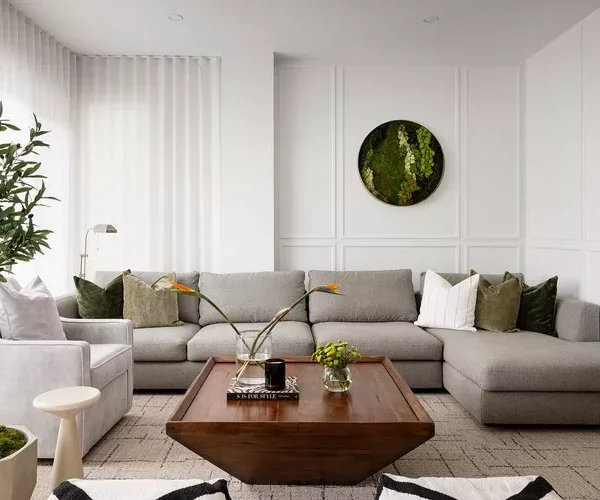
Rooms become calmer when one element leads. That might be a sofa facing a low media unit, a dining table beneath a pendant light, or a bed framed by a headboard wall that gives the room its shape. The point is not to create a stage set. The point is to stop every object from acting like the star.
People often chase beautiful home spaces by shopping for statement pieces first. The smarter move is the reverse. Pick the element that deserves visual priority, place it with conviction, and let every supporting piece fall into rank. That is how a room stops looking accidental.
A small apartment can prove this better than a large house. In a compact living-dining zone, one rug placed under the full seating group can anchor the lounge area and separate it from the dining side without a wall in sight. The room feels more expensive because it finally knows where one function ends and the next begins.
Scale matters more than most people admit
Bad scale ruins good taste. You can own graceful furniture and still end up with a room that feels off because the pieces do not speak the same language of size, height, and visual weight.
This is where balanced furniture placement stops being theory and starts becoming rescue work. A tiny rug under a large sectional makes the whole seating zone look underfed. A massive coffee table in a narrow room turns every walk across the floor into an obstacle course. A dainty side chair next to a broad sofa looks apologetic.
The fix is not mathematical perfection. It is proportion with nerve. Let larger pieces hold the ground. Let smaller ones relieve the weight instead of disappearing inside it. When scale lands properly, the room settles without asking for applause.
Use Contrast to Create Quiet Drama
After anchor and proportion are working, the room needs tension. Not clutter. Not chaos. Tension. A polished space feels alive because it balances opposites: soft and hard, dark and light, tailored and relaxed, old and new.
Rooms with no contrast feel flat, while rooms with too much contrast feel restless. The sweet spot sits in the middle, where difference sharpens the mood without breaking it.
Mix clean lines with one softer interruption
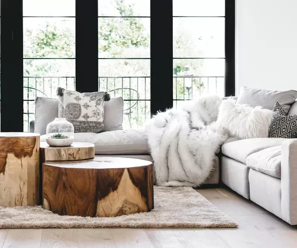
A room filled with hard-edged furniture can look sharp in photos and stiff in real life. That is why the best layouts often include one soft interruption that loosens the scene. A curved chair near a square coffee table. A rounded lamp beside a crisp console. A woven stool next to a lacquered cabinet.
That move gives room flow ideas a visual side, not only a physical one. Your eye travels more smoothly when the shapes in a room do not all hit with the same force. The room starts to feel composed instead of rigid.
This is also where people who care about polish usually get timid. They match too closely because they fear one unexpected shape will ruin the mood. It rarely does. What ruins the mood is sameness. A room needs one note that bends the melody without breaking it.
Let texture do the heavy lifting
You do not need loud color to make a room feel layered. Texture can carry the whole atmosphere when layout is doing its job. Linen against wood. Matte pottery near glass. A flat-weave rug under a plush seat. Those pairings give the room depth without turning it into a showroom display.
This is the part of elegant interior styling that many people miss because texture is quieter than color. It does not shout from the doorway. It reveals itself once you spend time in the room, and that slow reveal is what makes a space feel mature.
Think about a bedroom with neutral walls, oak bedside tables, a cotton coverlet, and a single ceramic lamp with a chalky finish. Nothing there begs for attention. Yet the room feels rich because each surface brings a different kind of restraint. That is quiet drama done properly.
Finish with Discipline, Not Decoration Panic
The last stage is where plenty of good layouts lose their nerve. People get the room 80 percent right, then crowd it with filler because empty surfaces start to make them anxious. That final burst of over-decorating is what drags a polished space back into confusion.
A classy room is finished by editing, not by proving how many accessories you own. The last layer should support the structure you built, not hide it.
Style in small clusters and stop sooner
Accessories work best in small, deliberate groups. One tray on a coffee table with a book and one object. A console with a lamp, a bowl, and one piece of art above it. A dining table that is allowed to breathe between meals. You are aiming for intention, not inventory.
This is where beautiful home spaces separate themselves from rooms that only photograph well from one angle. The strongest interiors look calm from the doorway and still hold interest when you move closer. That takes editing. It also takes self-control, which is rarer than people think.
A useful rule is simple: once a surface feels complete, remove one item and look again. Nine times out of ten, the room improves. Excess often enters not because a room needs more, but because the owner got nervous and kept going.
Make the room fit your life, not a fantasy
A polished layout that ignores your habits will fail on contact. A stunning chair that nobody sits in becomes sculpture. A walkway blocked by a styled bench becomes a daily annoyance. A dining nook arranged for magazine symmetry falls apart when your laptop, keys, and grocery bags enter the scene.
That is why balanced furniture placement must answer to real behavior. If you read at night, your chair needs light and a place for a mug. If children run through the room, sharp corners and fragile stacks should not dominate the path. If guests gather in the kitchen, the nearby seating should welcome spillover instead of forcing people to perch awkwardly.
The homes that feel the most refined are usually the ones that know exactly how their people live. Not the homes that pretend life never happens there. Style should sharpen your routines, not punish them.
A home does not become polished because every object matches or because every corner is filled. It becomes memorable when the room feels settled, useful, and slightly self-assured. That is the real power of a classy layout guide: it teaches you to edit with purpose, place with confidence, and leave enough breathing room for the house to speak for itself.
Start with one room. Clear the path people walk. Choose the piece that should lead. Cut what feels noisy, then stop decorating before the room starts begging for attention again. Do that well, and your home will not merely look better. It will feel like someone finally understood what the space was trying to become.
Frequently Asked Questions
What makes a home layout look more refined?
Clear movement, strong focal points, proper scale, and disciplined editing do most of the work. A refined room rarely depends on expensive items alone. It feels calm because each piece belongs where it sits and nothing fights for attention.
How do you arrange furniture in a small room without making it feel crowded?
Pull furniture into a defined zone instead of pushing every piece against the walls. Keep walking paths open, use fewer pieces with stronger presence, and avoid oversized tables or rugs that break the room’s rhythm.
What are the best room flow ideas for open-plan spaces?
Use rugs, lighting, and furniture grouping to mark each function without blocking sightlines. Keep pathways clear between major zones and let one area lead visually so the space reads as connected instead of chopped apart.
How can you create elegant interior styling without buying new furniture?
Reposition what you already own, remove pieces that add noise, and build stronger contrast through texture and spacing. A room often improves faster through editing and scale fixes than through another round of shopping.
Why does balanced furniture placement matter so much?
It keeps the room from feeling lopsided, cramped, or visually weak. When large and small pieces share the space with proper proportion, the room feels stable, easier to use, and far more polished.
How many decorative items should be on a coffee table or console?
Fewer than most people think. A tight grouping of two or three items usually looks stronger than a crowded spread. The goal is one clean visual statement, not a collection that turns the surface into storage.
Can beautiful home spaces still feel practical for daily family life?
Yes, and they should. The best rooms respect real habits, daily traffic, and the way people gather. A home feels more polished when it supports life gracefully instead of forcing everyone to tiptoe around styling choices.
What is the first thing to change when a room feels off?
Fix the layout before touching color or décor. Check walking paths, focal points, and spacing between major pieces. Once the structure works, the room usually starts improving fast because the rest finally has a solid base.