
A room can have expensive furniture, decent lighting, and all the right colors on paper, then still feel off the second you walk into it. That uneasy feeling usually has nothing to do with budget. It comes from arrangement. When a space feels calm, clear, and quietly polished, it is rarely an accident. It is the result of choices that guide your eye without shouting for attention.
That is why a classy layout matters more than most people think. It gives a room order without making it stiff. It lets bold pieces breathe, keeps practical items from taking over, and makes even ordinary spaces feel considered. You do not need a designer’s budget to get there. You need restraint, a sense of proportion, and the willingness to stop adding things once the room starts speaking for itself.
The rooms people remember are not always the grand ones. They are the ones that feel settled. They invite you in, then make you want to stay. If you want that effect in your own home, start with layout before you chase decor. Placement does more of the heavy lifting than people admit. For more ideas on polished presentation and brand-worthy visual standards, explore design-focused media resources that show how refined composition shapes perception in every setting.
Start With the Room’s Natural Logic
Every room has a built-in rhythm, and most bad layouts happen when people fight it. They shove furniture where they think it should go instead of where the room wants it to go. A classy interior begins when you notice the obvious things that many people rush past: where you enter, where light lands, where people pause, and what naturally draws the eye first.
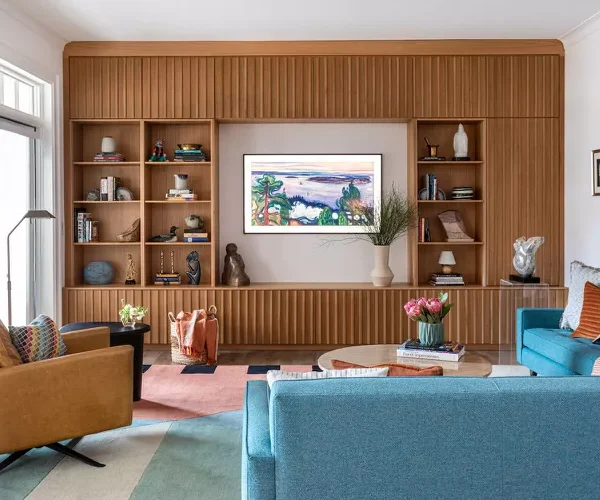
A room with one strong feature is easier to arrange than a room with five weak ones. That feature might be a fireplace, a large window, a headboard wall, or even a striking rug. Once you know what deserves attention, the rest of the layout can support it instead of competing with it. That is how room flow starts to feel effortless rather than managed.
Read the Architecture Before You Place a Single Piece
Walls are not the whole story. Openings, ceiling height, built-ins, radiators, beams, and even awkward corners shape how the room behaves. If you ignore those signals, the layout always looks borrowed, as if it belongs to another house. Good arrangement listens first.
A long living room, for example, often fails when you line everything against the walls and leave a dead zone in the middle. That setup may seem safe, but it usually makes the room feel thinner and colder. Pulling the seating inward creates a destination instead of a hallway with cushions. The room begins to hold a conversation.
Small bedrooms reveal the same truth. If the bed barely fits on one wall, stop pretending it should float in the center like a magazine spread. Work with the shape you have. A layout looks elegant when it accepts the room’s limits and turns them into structure. Denial never reads as style.
Build Around Movement, Not Decoration
A polished room should never make people sidestep a table leg, squeeze behind a chair, or hesitate at the doorway. Layout comes before styling because movement decides whether a room feels gracious or irritating. You feel this before you notice color or art.
The smartest furniture placement creates paths that seem obvious without being empty. In a dining room, that means enough clearance to pull out chairs without knocking into a console. In a bedroom, it means walking around the bed without brushing every surface on the way. In a living room, it means reaching a seat, a lamp, or a coffee table without threading a maze.
This is where many people overfill a room. They confuse “finished” with “full.” A classy room leaves space on purpose. Empty space is not wasted. It is the part that lets everything else feel intentional.
Use Scale to Make the Space Feel Quietly Expensive
Once the room’s logic is clear, scale decides whether it feels settled or awkward. This is the part people skip because it sounds technical. It is not. Scale is simply the relationship between objects, walls, and the people who use them. Get that right and even modest furniture can look polished.
A room feels cheap when everything is the wrong size at the same time. Tiny rugs make seating groups look stranded. Overbuilt sectionals crush small living rooms. Delicate side tables beside thick, heavy sofas look like afterthoughts. You do not need matching sets. You need visual balance, and that starts with proportion.
How a Classy Layout Handles Size Without Looking Staged
A refined room does not rely on giant statement pieces to prove a point. It relies on pieces that belong together. That distinction changes everything. You want the room to feel composed, not rehearsed.
Choose Anchor Pieces That Fit the Room, Not Your Wishlist
The biggest piece in the room sets the tone, whether that is a sofa, dining table, bed, or desk. If it is too small, the space feels timid. If it is too large, the room feels cornered. There is no rescue plan for a sofa that eats half the floor.
Think of a rug as the quiet negotiator. It tells your main furniture where to live together. In a seating area, a rug that only touches the coffee table often makes the room feel disconnected. A larger rug that sits under the front legs of the seating gives the arrangement weight and cohesion. That single change can fix a room that felt strangely unfinished.
Dining rooms suffer from the same mistake in reverse. People buy a table for six, then crowd it with eight chairs and a sideboard that barely clears the path behind them. The result feels tense. A room should not look like it is holding its breath.
Layer Heights So the Eye Moves With Ease
A classy room needs height variation or it falls flat. When every piece sits at the same level, the room starts to look boxed in. This is where lamps, artwork, shelving, drapery, and tall plants do quiet work.
The aim is not drama for its own sake. You are creating a visual climb. A low sofa, medium-height side chairs, a taller floor lamp, and artwork placed with care give the eye a natural route. That is how visual harmony develops. The room begins to feel measured instead of accidental.
You can see this in a home office as clearly as in a lounge. A desk, low cabinet, floating shelf, and tall reading lamp create a layered skyline. Without that spread of heights, the room feels static, no matter how nice the furniture is. A little contrast wakes the space up. Too much of it turns the room restless.
The sweet spot is calm movement. Your eye should travel, then settle.
Create Focal Points That Hold Attention Without Begging for It
A room loses elegance when every object fights for lead role. Good layout solves that by deciding what matters most, then letting the rest fall into supporting positions. This is one of the clearest marks of a grown-up interior. It knows where to pause.
Many people try to make every corner “special.” That instinct ruins more rooms than neglect does. You do not need ten moments. You need one strong moment, a second quiet one, and enough restraint to leave the rest alone. That is where balanced decor earns its name.
Let One Area Lead and the Rest Support It
In a living room, the lead might be the fireplace wall, a large artwork, or the main seating group. In a bedroom, it is usually the bed. In a dining room, it is the table under the light fixture. Once the lead is clear, every other piece should either frame it, echo it, or stay out of its way.
Take a common mistake: a television over the fireplace, bold curtains, a patterned rug, oversized art on the side wall, and shelves packed with objects. None of those choices is wrong alone. Together, they turn the room into an argument. A classy room avoids arguments. It picks a winner.
That is also why symmetry works so well when you want a polished look. Matching lamps, balanced nightstands, or paired chairs create order fast. Yet symmetry should not become a prison. A room with perfect mirror-image placement can feel lifeless. The best interiors break symmetry with something human, such as an offset vase, an uneven branch arrangement, or a single sculptural stool.
Edit Accessories Like a Ruthless Adult
A beautiful layout can be buried under too many small things. Accessories should sharpen the room, not explain it to death. If every surface holds candles, books, bowls, frames, and objects from three shopping trips, the layout disappears under the noise.
This is where room flow and styling collide. A room must have places for the eye to rest. Leave parts of shelves open. Let a console hold two strong items instead of seven polite ones. Keep coffee tables useful enough to live with and restrained enough to look composed.
The counterintuitive truth is that fewer objects often make a room feel richer. Not barer. Richer. A single heavy ceramic lamp beside a clean stack of books usually does more for the room than a dozen decorative fillers. The same goes for art. One properly scaled piece can carry a wall better than a gallery arrangement that looks nervous and overworked.
If you want the room to feel refined, stop decorating every inch as if silence were a problem.
Shape Comfort and Function So the Room Still Works on a Tuesday
A room can look polished in photos and fail in daily life. That kind of beauty does not last because people start rearranging it the moment real routines hit. A classy layout has to survive ordinary use. It should work when groceries come in, when someone drops a bag on the chair, when guests stay longer than planned, and when you need the room to do its job without ceremony.
This is where taste separates from fantasy. The best layouts respect real life. They do not bow to it completely, but they do not pretend it does not exist either. When comfort and order work together, the room feels lived in without slipping into clutter.
Give Every Zone a Job
Open-plan spaces expose weak planning faster than any other layout. When the sofa area bleeds into the dining space and the entry has no identity, the whole room feels temporary. You fix that by assigning zones, not by adding more furniture than the space can handle.
A rug can define the sitting area. A pendant can pin down the dining table. A bench or narrow console can mark the entry without building a wall. Those boundaries matter because they tell you where each activity belongs. That gives the room discipline.
The same principle helps in smaller rooms. A bedroom can hold sleep, reading, and dressing if each function has a clear place. A chair in the corner becomes useful when paired with a lamp and small table. Without that trio, it becomes a clothes pile waiting to happen. Good furniture placement prevents bad habits before they start.
Make the Room Easy to Maintain, or It Will Fall Apart Fast
A layout that demands constant correction is not a good layout. If cushions slide into the walkway, if side tables block sockets, if doors hit furniture, or if storage sits too far from where you use it, the room will unravel. Style that cannot survive daily friction is decoration, not design.
This is where visual harmony needs a practical backbone. Baskets should live where clutter appears, not where they look cute. Side tables should be close enough to hold a cup without a stretch. Lighting should serve evening life, not only daylight photos. If a lamp leaves your reading chair dim, the room has failed one of its simplest tests.
Children’s rooms and guest rooms prove this point with no mercy. Put storage too high, and the floor fills up. Put the guest bed where no one can reach the window or bedside surface, and the room feels thoughtful only from the hallway. Daily ease is what keeps a space polished long after the styling high wears off.
That is also why balanced decor depends on usefulness more than people admit. The tray on the ottoman, the bench at the foot of the bed, the cabinet by the door, the lamp near the chair—each one should earn its place. Beauty holds attention. Function earns trust.
A room becomes memorable when it does both.
Conclusion
The difference between a pretty room and a room with staying power comes down to discipline. Not strictness. Discipline. You notice the room’s shape, respect movement, scale pieces with care, and edit harder than your first impulse wants to. That is how a home begins to feel collected instead of crowded.
A classy layout is never about copying a showroom or buying your way into polish. It comes from knowing where to place weight, where to leave breathing room, and where to stop. That final part matters most. Many rooms are ruined by one extra chair, one extra shelf, one extra attempt to prove the owner has taste. The stronger move is restraint.
So walk through one room in your home today with fresh eyes. Remove what blocks movement. Shift what feels undersized or adrift. Let one focal point lead. Then live with the quieter version before adding anything back. Start there, and you will build a room that feels calm the second you enter it—and hard to forget after you leave.
Frequently Asked Questions
What is the best way to arrange furniture in a small room?
Start by clearing a clean walking path, then choose one main focal point and build around it. Use fewer pieces than you think you need, and keep larger items scaled to the room so the space feels open rather than squeezed.
How do you make a room layout look more elegant?
Use stronger spacing, better proportion, and less clutter. Elegant rooms usually have one clear focal point, a steady mix of heights, and surfaces that are styled with restraint instead of being packed with decorative items.
How can you improve room flow without renovating?
Move furniture away from blocked pathways, cut pieces that serve no purpose, and define zones with rugs or lighting. Most flow problems come from arrangement mistakes, not from architecture that needs expensive changes.
What size rug works best for a living room layout?
Pick a rug large enough to connect the seating area. At minimum, the front legs of the sofa and chairs should sit on it. Small rugs often make the whole room look scattered and oddly temporary.
How do you create visual balance in a bedroom?
Center the bed when the wall allows it, then support it with nightstands, lamps, and art that feel even in weight. Balance does not require perfect matching, but it does need a sense of order from side to side.
Why does my room look cluttered even when it is clean?
The problem is often visual noise, not dirt. Too many small objects, weak focal points, and furniture that fights for attention can make a clean room feel busy. Editing decor usually helps faster than buying more storage.
How do you decorate a room without overfilling it?
Choose a few pieces with presence and let them breathe. Leave blank wall space, open shelf space, and clear surfaces where the eye can rest. Rooms feel stronger when every item has a reason to be there.
What makes a home layout feel expensive on a budget?
Good proportion, thoughtful lighting, and disciplined editing do more than price tags. When furniture fits the room, pathways stay open, and decor feels selective, the space reads polished even if the pieces were bought slowly over time.