A polished room does not happen because you bought expensive pieces. It happens when the layout makes the room feel calm before anyone notices the sofa, the lamp, or the art on the wall. That first impression carries weight, and it is why classy layout inspiration matters more than most people admit. A room can be full of good furniture and still feel awkward, crowded, or oddly cold.
The fix is rarely dramatic. More often, it comes from cleaner spacing, stronger focal points, and better choices about what deserves attention. That is also why people chasing a thoughtful interior design perspective often miss the real issue: they keep shopping instead of editing the room they already have. The smartest layouts do not shout. They guide your eye, settle your mood, and make daily life feel easier.
If you want a home that feels polished instead of staged, you need more than decoration. You need structure. Once the bones of a room make sense, everything else starts pulling in the same direction.
Why Classy Layout Inspiration Starts With Restraint, Not More Stuff
The fastest way to ruin a good room is to treat every empty corner like a problem. Empty space is not wasted space. It is what gives shape, pause, and control to the room you are building. When you stop trying to fill every gap, your home starts to feel deliberate instead of restless.
Why fewer anchor pieces create stronger rooms
Strong rooms usually begin with one or two pieces that carry visual authority. That might be a deep sofa with clean lines, a large rug with quiet pattern, or a dining table that grounds the whole zone. Once those anchors are in place, the room stops begging for attention from six smaller objects trying to do the same job badly.
You can see this in old apartments with high ceilings and modest furnishings. A single long sofa, one generous rug, and a well-placed lamp often create more presence than a room packed with accent chairs, side tables, and decorative clutter. The room breathes because it has rank order. Everything knows its role.
That is where many people lose the plot. They think class comes from accumulation when it usually comes from subtraction. A room starts feeling expensive when nothing in it appears desperate to be noticed.
How negative space sharpens a refined home aesthetic
A refined home aesthetic depends on what you leave out as much as what you bring in. Negative space gives furniture shape. It makes a console table feel sculptural, a reading chair feel intentional, and a bed feel settled rather than squeezed into place. Without that margin, even beautiful pieces look cramped.
One of the clearest examples shows up in living rooms where the furniture hugs every wall. People assume this opens the room. It often does the opposite. Pulling a sofa even a few inches forward can create depth, better walking flow, and a stronger conversation area. Small shifts change the tone of the whole space.
Restraint also protects you from trend fatigue. Rooms built on breathing room age better because they are not leaning on a pile of short-lived details to create interest. That kind of calm lasts.
How to Build Movement and Balance Without Making the Room Stiff
Once you cut the clutter, the next challenge appears: a room can turn clean and still feel dead. Order alone is not enough. A polished interior needs movement, rhythm, and tension. That balance is what separates a room that looks tidy from one that feels alive.
How sightlines shape elegant room design
Elegant room design begins with what your eye catches first and what it discovers next. Sightlines decide whether a room feels composed or confused. When you enter a space and your gaze lands on one clear focal point, the room feels settled. When your eye bounces from a giant TV to a busy shelf to a random accent chair in the corner, the space feels unsettled before you sit down.
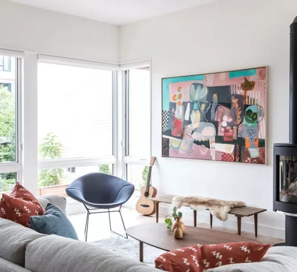
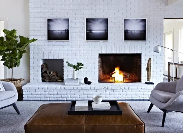
A focal point does not need to be dramatic. A fireplace, a low bookcase with large-scale art, or a window framed with clean drapery can all do the job. The point is not to create a spectacle. The point is to give the room a center of gravity.
That center also helps you arrange secondary pieces with more confidence. Once the room has a visual anchor, chairs can support it, lighting can echo it, and accessories can stay in service instead of grabbing control. Good rooms have hierarchy. Weak rooms have competition.
How asymmetry gives sophisticated interiors their ease
Many people assume symmetry is the safest route to polished design. It can be. It can also make a room feel rigid enough to resemble a hotel lobby. Sophisticated interiors often rely on controlled asymmetry because it feels more human, more relaxed, and far less rehearsed.
Think about a bedroom with two identical lamps but one oversized artwork off-center above the bed. Or a living room with a centered sofa, then a sculptural floor lamp on one side and a slim drink table on the other. The room still feels balanced, but it avoids that stiff, overly matched effect that drains character from the space.
This is where instinct matters. You do not need mirror-image placement to create calm. You need visual weight to feel resolved. A tall plant can answer a chunky chair. A stack of books can answer a ceramic lamp. Once you understand that, your layout gains personality without losing discipline.
The Best Layouts Make Daily Living Feel Effortless
A polished home should not force you to tiptoe around it. The smartest rooms respect how you move, sit, work, host, and rest. Beauty that fights daily life gets old fast. Good layout work earns its keep because it makes the room easier to live in every single day.
Why traffic flow matters more than decorating talent
A room can photograph well and still be annoying to use. That happens when furniture interrupts walking paths, seating angles feel awkward, or you need to sidestep a coffee table every time you cross the space. Luxury interior styling falls apart the minute the room starts irritating the people who live there.
The rule is simple: your body should never feel blocked by the room. Walkways need space. Door swings need respect. Seating should support conversation without forcing people into strange angles. In open-plan homes, this matters even more because layout has to define zones without building invisible walls that fight movement.
You can test this in ten seconds. Walk through the room while carrying a tray, a laundry basket, or a laptop. If the route feels clumsy, the layout is wrong. That kind of test tells you more than any mood board ever will.
How functional zones support a refined home aesthetic
A refined home aesthetic gets stronger when each area has a clear job. This matters in large rooms, but it matters even more in smaller ones where one space needs to handle multiple roles. A living room might need a conversation area, a reading corner, and hidden storage without feeling chopped into pieces.
The answer is not more furniture. It is smarter zoning. A rug can mark the main seating area. A narrow chair and lamp can create a reading spot near a window. A bench behind the sofa can quietly separate functions without adding visual noise. When each zone has purpose, the room feels composed rather than crowded.
That is also why random filler furniture causes so much damage. Pieces without a job eat floor space, break flow, and muddy the room’s logic. The best layouts are not packed with options. They are clear about what the room is meant to do.
Finishing Touches Only Work When the Layout Already Holds the Room Together
This is the part most people rush to first: art, pillows, objects, and finishing layers. Those details matter, but they should arrive late. When the layout is weak, styling becomes camouflage. When the layout is strong, styling becomes emphasis. That difference is everything.
When luxury interior styling should whisper instead of perform
Luxury interior styling looks strongest when it edits itself. You do not need shelves full of objects to prove taste. One bowl in the right stone finish, one lamp with clean proportion, or one piece of art with proper scale can do more than a dozen small gestures fighting for the same attention.
The same logic applies to texture. A nubby chair, a matte wood surface, and a soft curtain already create richness when they sit inside a disciplined layout. Add too many statements on top of that and the room starts pleading for approval. Quiet choices tend to age with more grace.
A lot of polished homes share this trait: they do not explain themselves. They trust the room to hold attention without layering on endless proof that someone decorated it. That confidence reads instantly.
How elegant room design depends on editing until it feels calm
Elegant room design often comes down to a final round of refusal. Refuse the extra side table. Refuse the third throw pillow that adds nothing. Refuse the art that is too small for the wall but hangs there because you already own it. Editing is not deprivation. It is what lets the room sound like one clear note instead of static.
This is where you need honesty. Stand in the room and ask a plain question: what here is earning its place? If the answer is unclear, the piece is probably weakening the whole. A well-edited room feels settled because nothing is there by accident.
By the end of that process, the home begins to carry the ease people often mistake for talent. It is not magic. It is judgment, and judgment improves every time you choose calm over clutter.
A beautiful interior does not need to impress from every angle. It needs to feel right when you walk in, sit down, and live your life in it. That is the lasting value of classy layout inspiration. It teaches you to shape a room around clarity, movement, and emotional ease instead of chasing a pile of decorative fixes.
The strongest homes rarely rely on excess. They rely on spacing that lets furniture breathe, focal points that guide the eye, and editing that keeps the room honest. Once you see that, your choices change. You stop buying filler. You stop crowding corners. You start noticing how a room supports your mood, your habits, and your sense of calm.
That shift is where polished interiors begin. Study your rooms with harder eyes, remove what has no job, and rebuild around flow before you buy another object. Start there, trust the quiet choices, and let classy layout inspiration turn your home into a place that feels composed the moment the door opens.
Frequently Asked Questions
What makes a home layout look classy instead of cluttered?
Strong spacing, clear focal points, and fewer competing pieces do the heavy lifting. A classy room usually feels edited, not packed. When each item has space around it and a clear role, the room reads as calm, polished, and far more expensive than it may be.
How do you create sophisticated interiors without buying new furniture?
Start by removing pieces that crowd the room or serve no purpose. Then adjust placement, improve sightlines, and create breathing room around your best furniture. Good arrangement can change the feel of a room faster than a shopping trip, and it costs nothing.
What is the first rule of elegant room design?
Choose one visual anchor and let the rest of the room support it. That anchor might be a sofa, dining table, bed, or fireplace. Once the room has a center of gravity, every other decision gets easier and the space feels more settled.
How can a small room still feel like a refined home aesthetic?
Keep the furniture scale honest, leave open floor area where possible, and avoid filling every wall. Small rooms gain polish from restraint. When you protect negative space and keep the palette controlled, the room feels intentional instead of squeezed.
Why does traffic flow matter in luxury interior styling?
A room loses its charm the moment it becomes annoying to move through. Easy walkways, sensible furniture placement, and seating that supports real use make the space feel smooth and natural. Comfort is part of the look, not separate from it.
How many focal points should one room have?
One main focal point works best in most rooms. You can have supporting moments, but only one area should lead the eye first. Too many competing centers make the room feel noisy, and that confusion weakens even strong furniture and good finishes.
Can asymmetry work in sophisticated interiors?
Yes, and it often works better than strict symmetry. Controlled asymmetry gives a room ease and personality without making it feel messy. The goal is not matching every object pair for pair. The goal is balancing visual weight in a way that feels natural.
How do you know when a room is fully styled?
You know it is done when removing one more item would make the room feel thin, but adding one more item would make it feel busy. That middle point is the sweet spot. Good styling ends with calm, not with decoration for its own sake.